Spicey Guava, brand identity case study
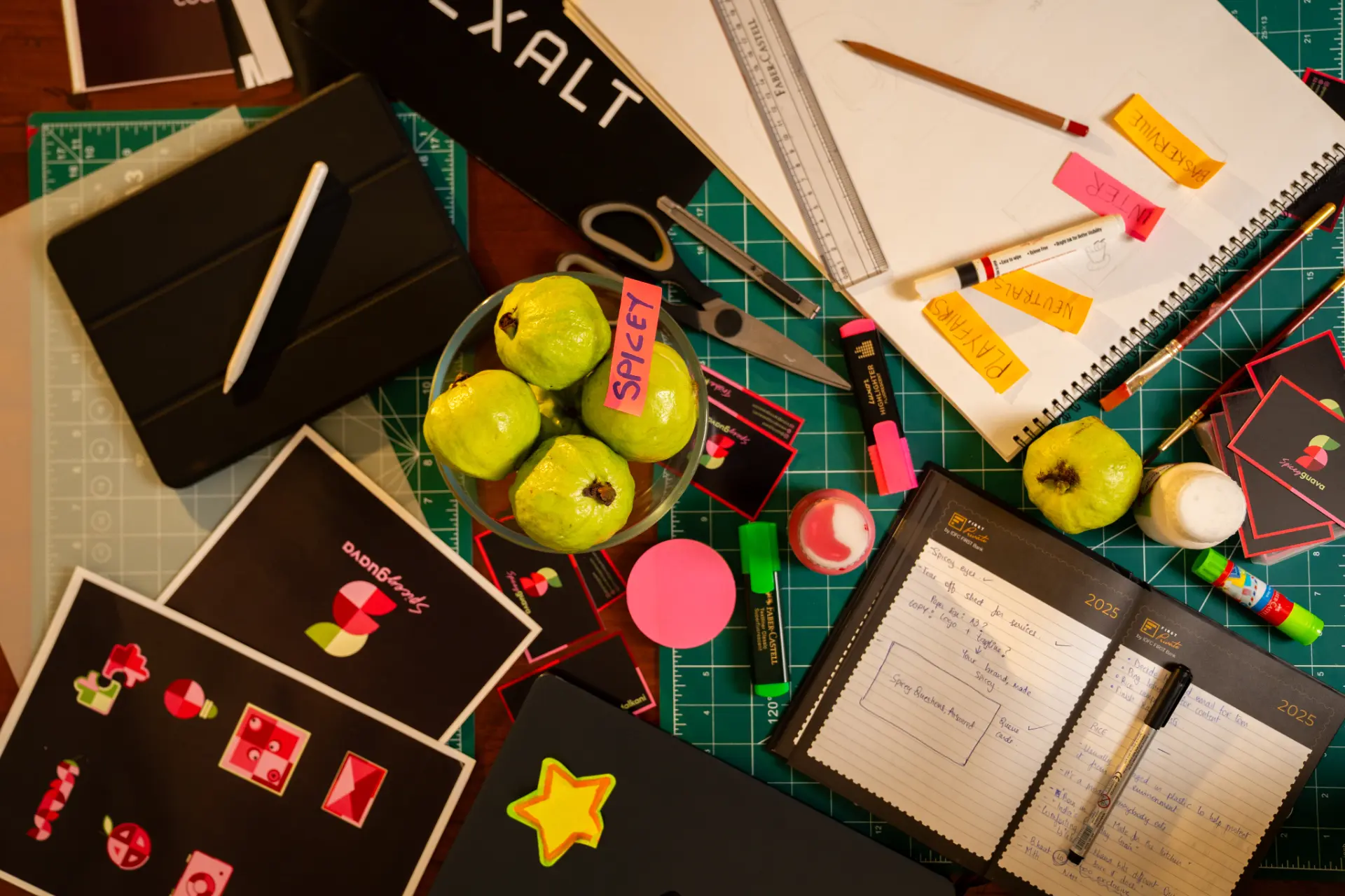
When I joined Spicey Guava, I noticed the founder was struggling with freelancers because the name “Spicey Guava” was difficult to translate into a visual identity. Most concepts looked like either a juice shop or a candy brand. This project focused on creating a distinctive brand identity that captured the agency's bold personality while remaining professional, strategic and memorable.
- Role
- Brand Strategist & Brand Designer
- Timeline
- June to August (2 months)
- Year
- 2025
Highlights
A fast-paced branding engagement built to meet the immediate needs of a rapidly growing marketing agency.
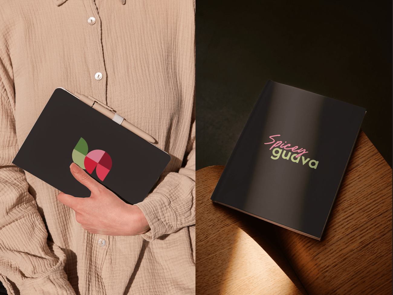
A distinctive logo mark that grew into a memorable, colourful and coherent visual identity system.
A scalable identity designed to keep growing alongside the business.
About
Spicey Guava was born from a simple idea: even the most boring fruit can leave a lasting taste if you know how to serve it right. We believe brands are the same.
Raw, messy, shapeless but full of potential. Like a guava with a kick of spice, we take the bland and make it bold.
We don't just design; we strategize, experiment, execute, and obsess until your brand makes people feel something.
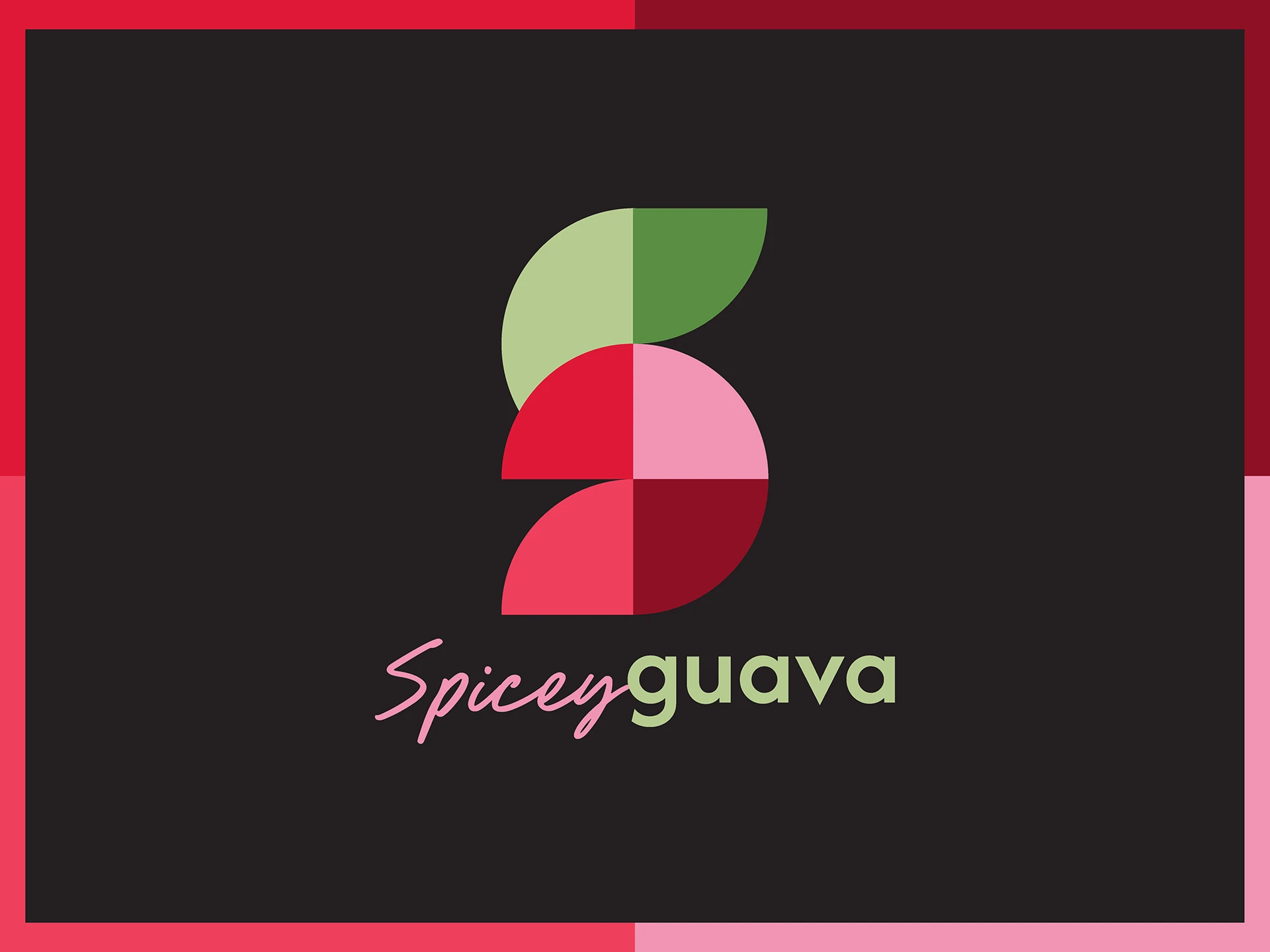
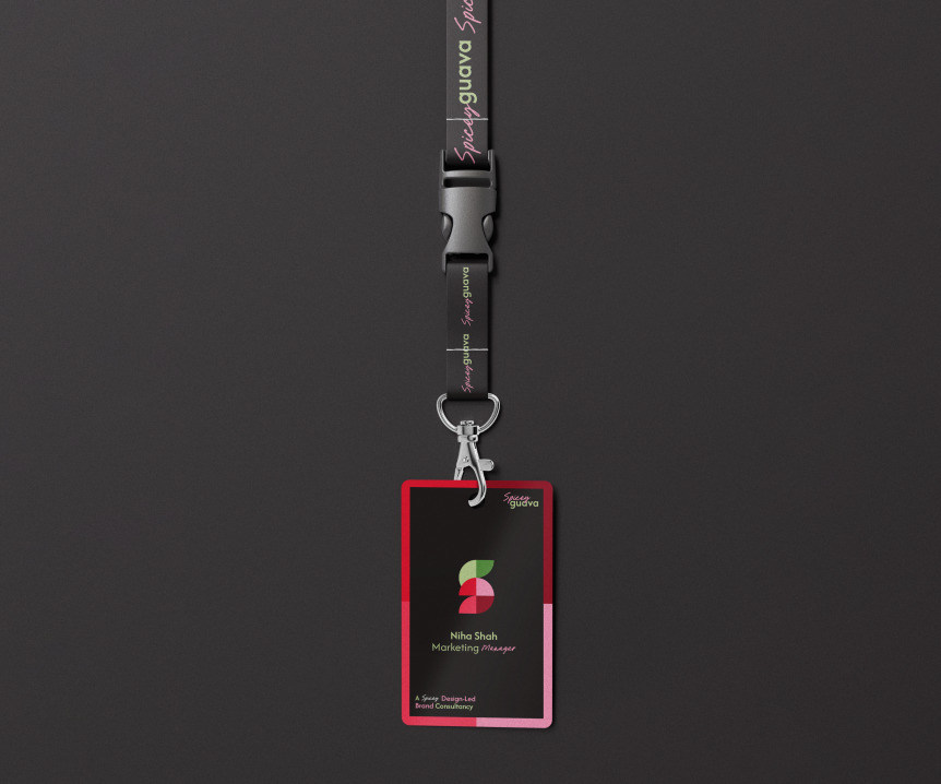
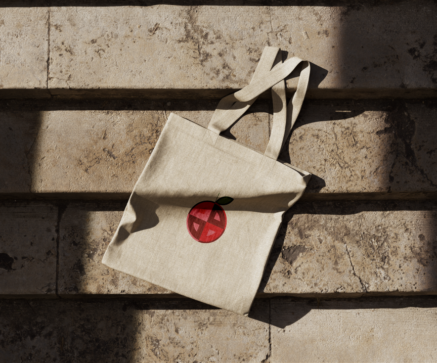
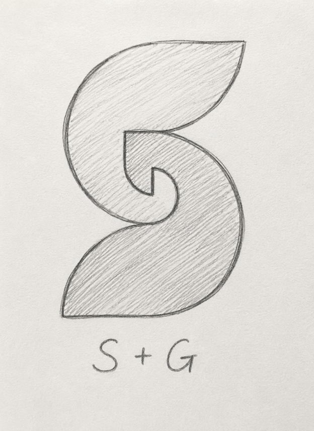
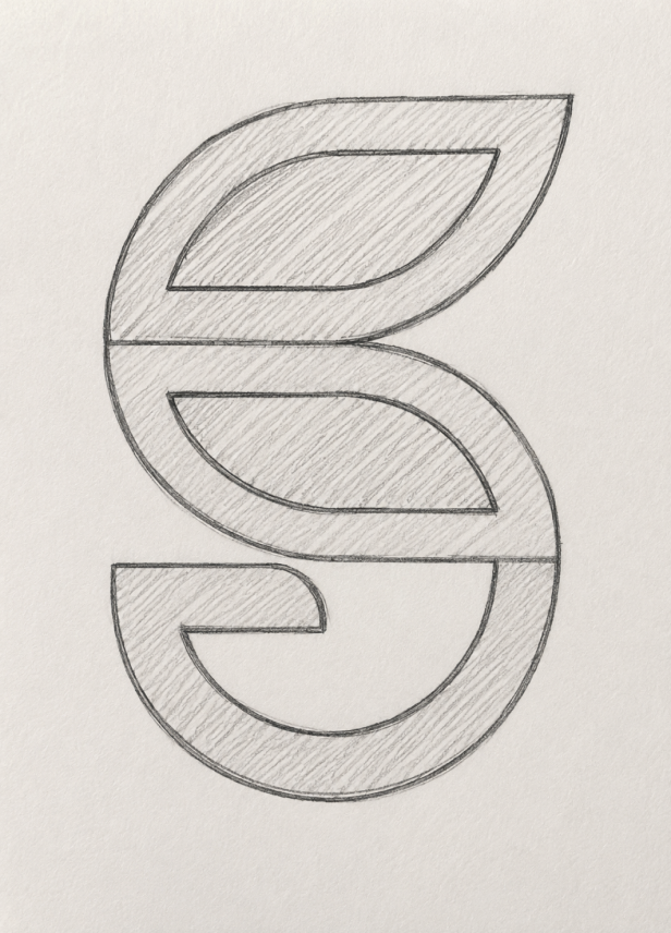
Our logo tells that story too. Made of ordinary shapes, which on their own are nothing but simple, mundane forms. But when structured with intention and precision, they create meaning, the S & G of Spicey Guava.
You bring the building blocks your idea, your confusion, your chaos and we bring the clarity, creativity, and, most importantly, the fire.
We turn scattered inputs into a cohesive brand that gets noticed and remembered.
We don't see ourselves as just marketers.
We're your brand's partner and guide.
We believe in thoughtful strategy, bold execution, and never sitting still.
That's the spice. That's Spicey Guava.
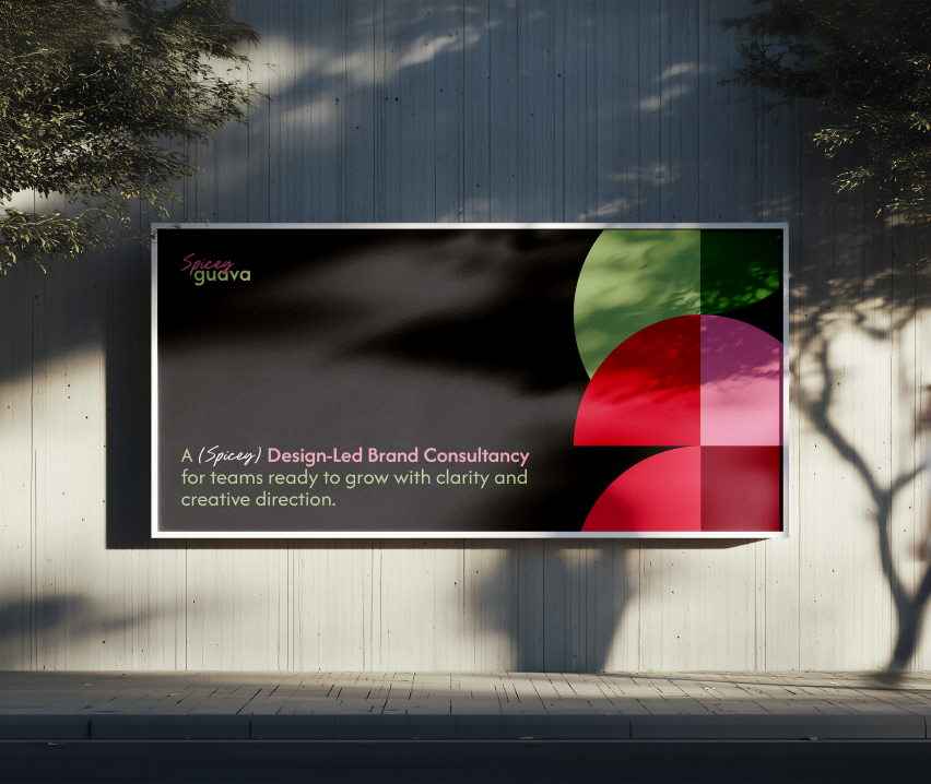
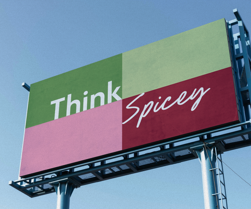
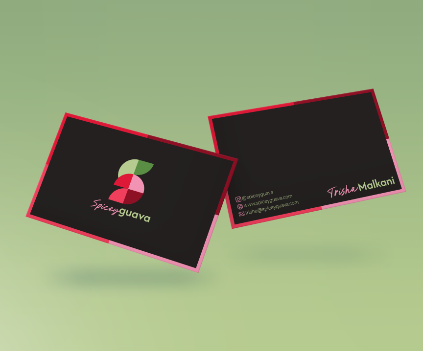
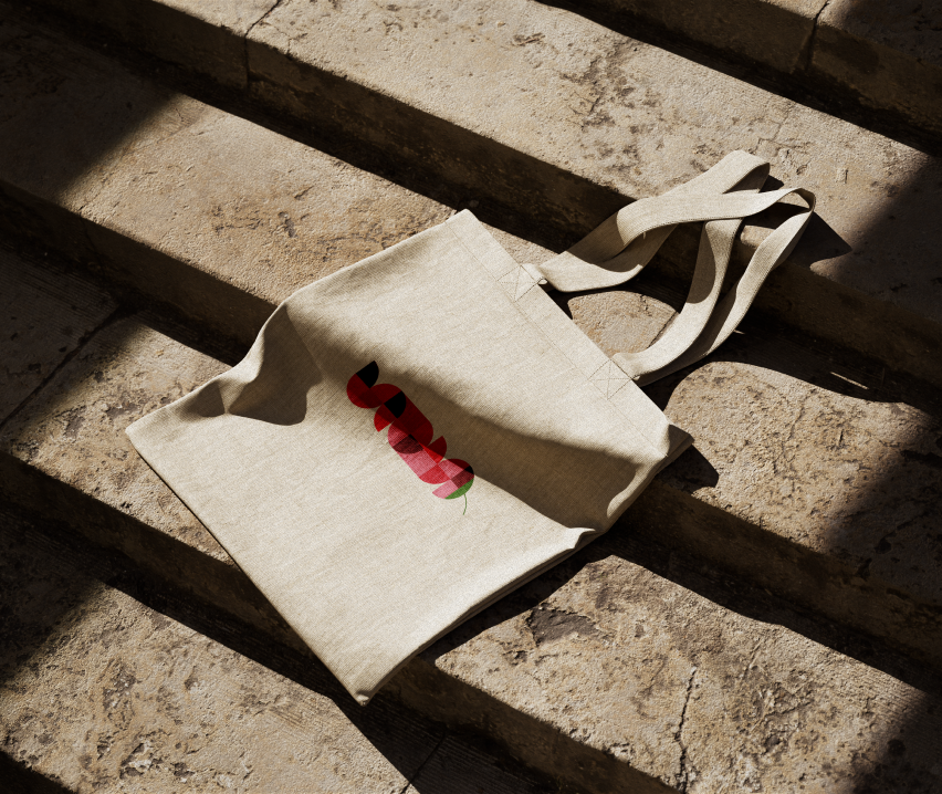
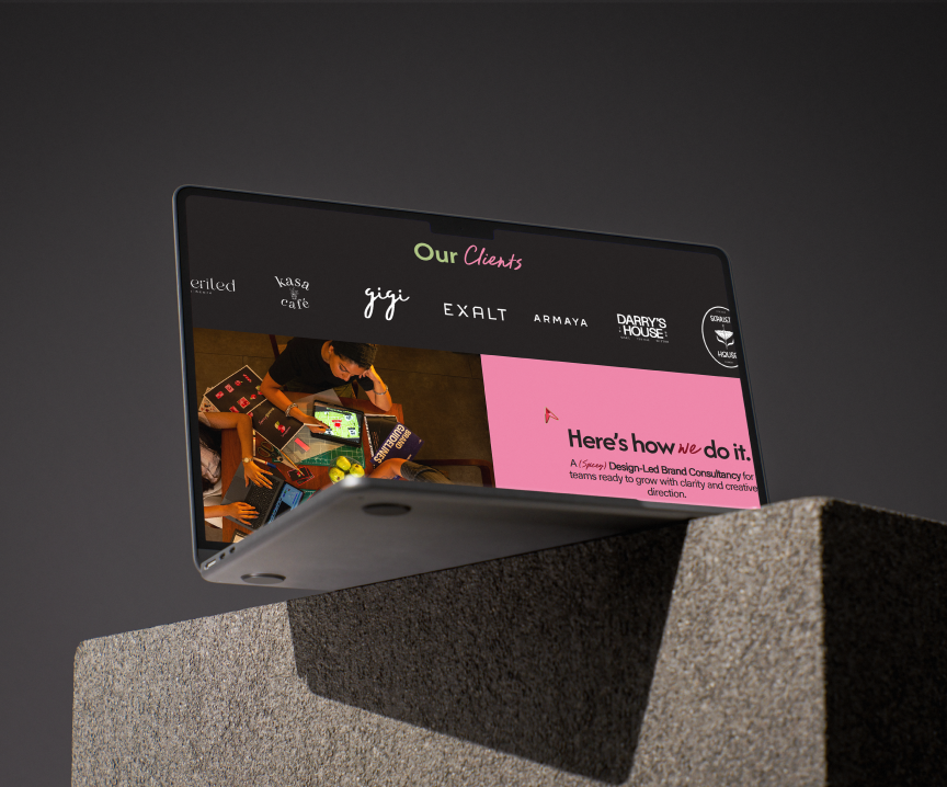
Brand imagery
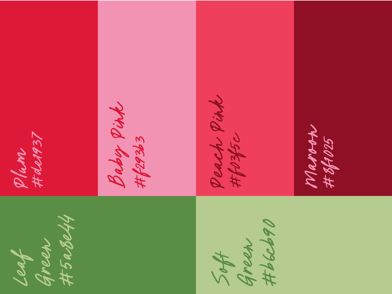

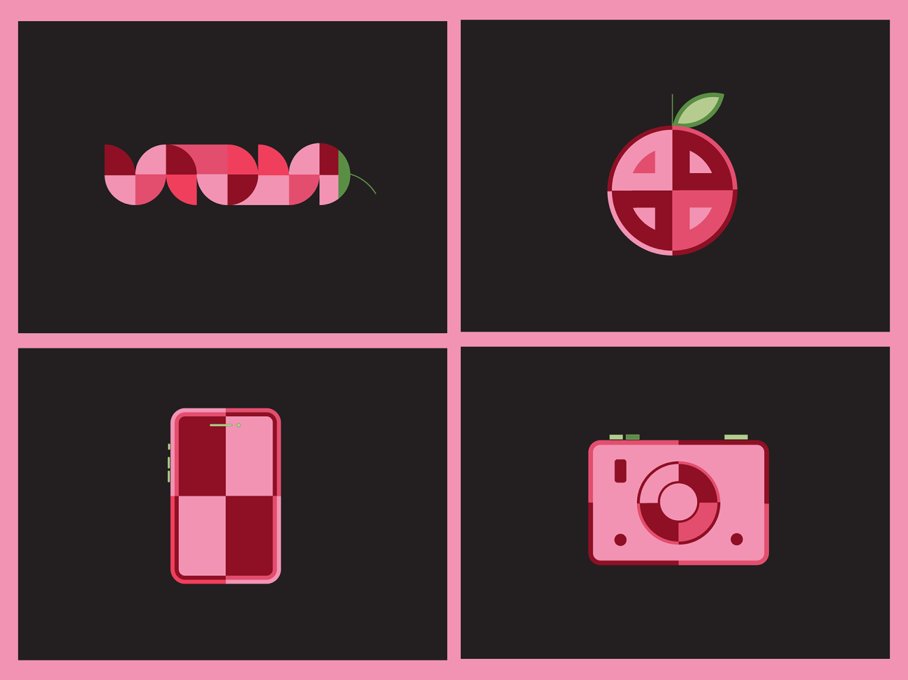

Process
One of the biggest challenges was creating an identity that felt bold and “spicy” while still communicating the professionalism of a marketing agency. Another objective was subtly incorporating both the letters S and G into the final logo mark. This section showcases the early logo explorations and the evolution that led to the final identity.
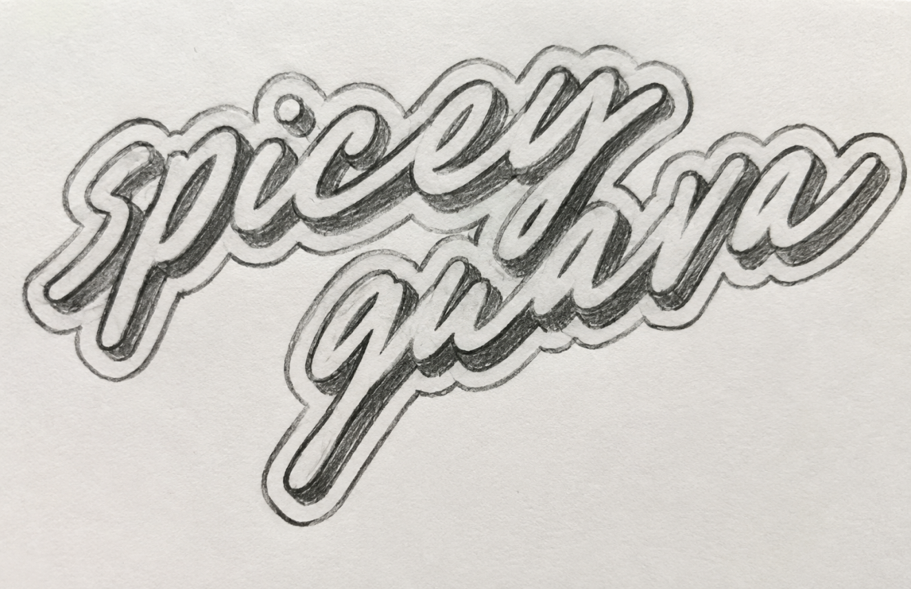
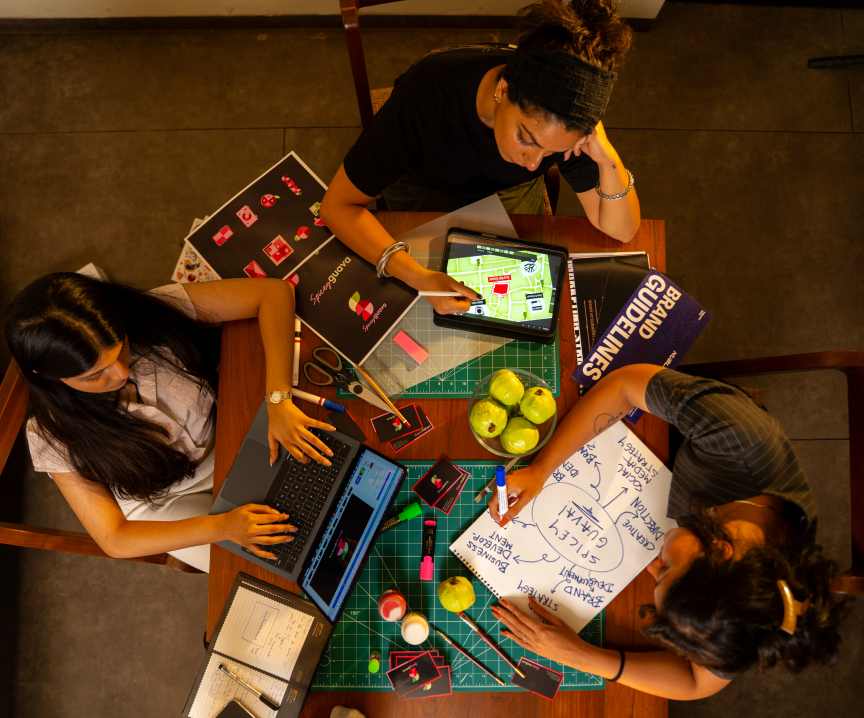
Spicey behind the scenes