un.paused, communication design case study

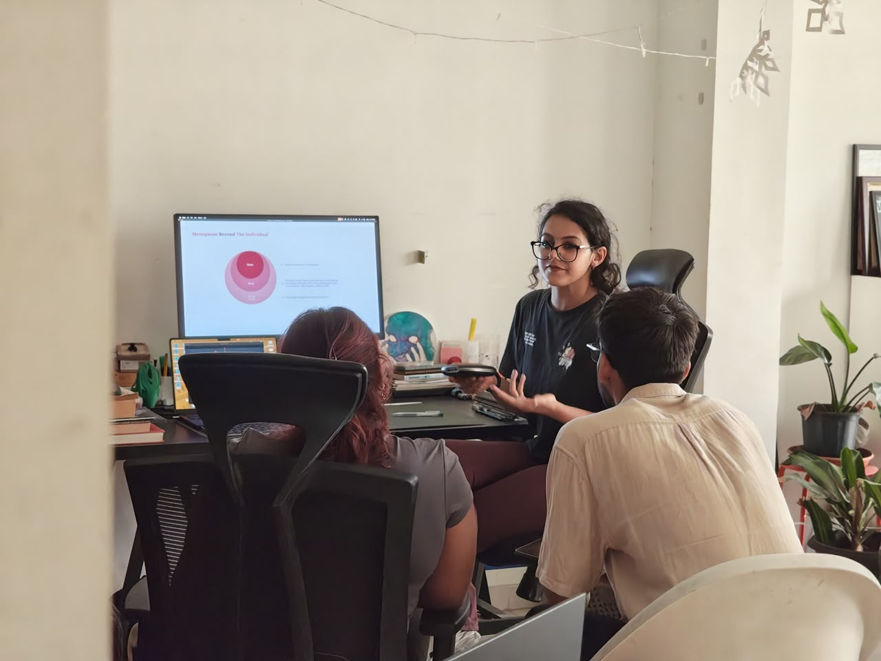
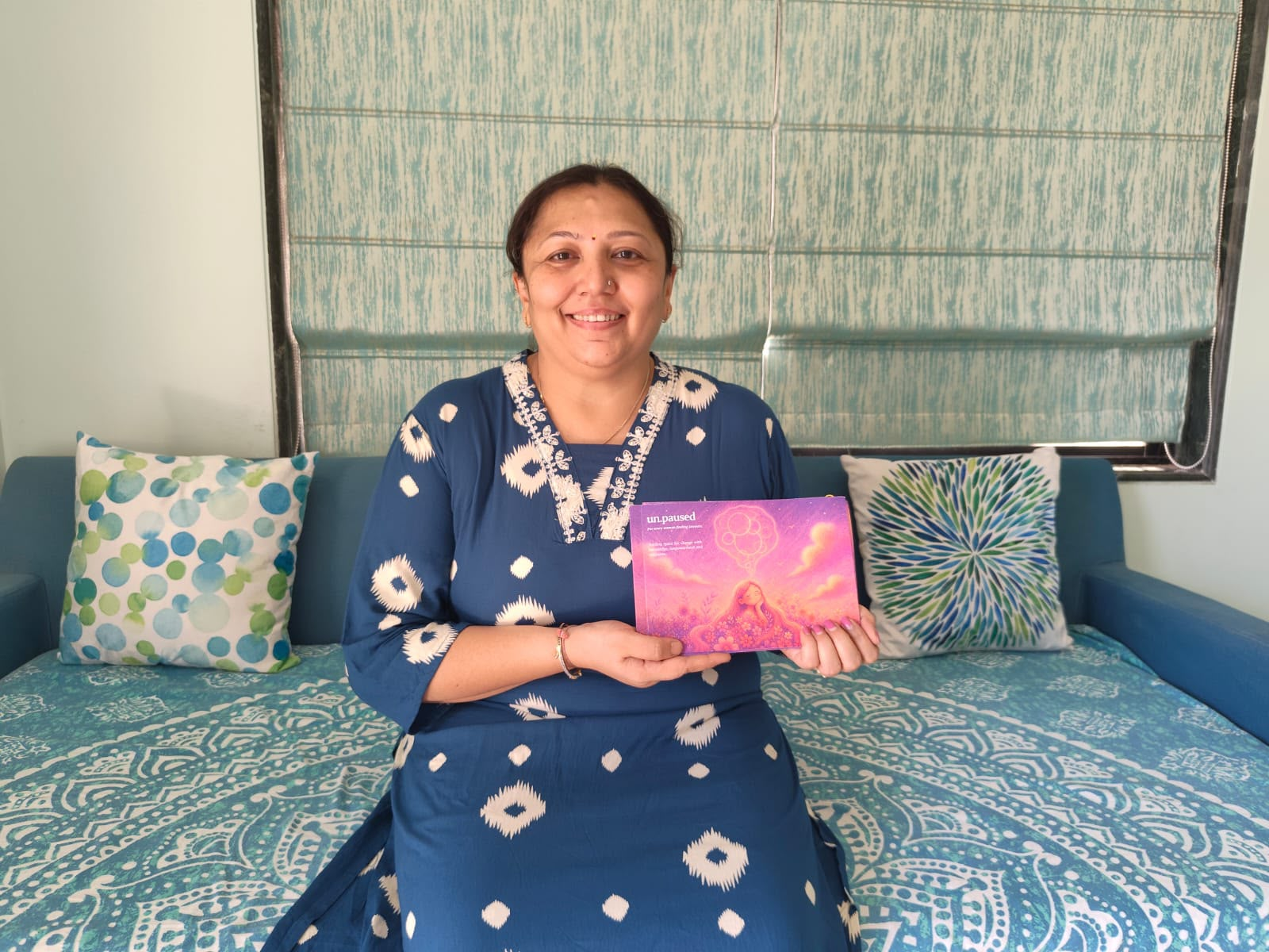
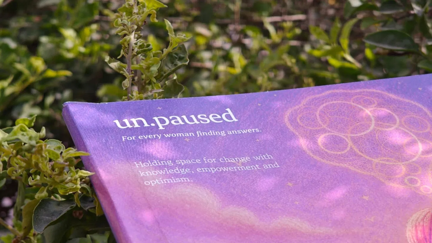
un.paused is a communication design initiative addressing the awareness and health literacy gap around perimenopause among urban Indian homemakers. The project translates complex biological and emotional experiences into an accessible, warm, and shareable publication system. Developed over six months as a graduation project under the guidance of Studio Carbon, Gandhinagar.
- Role
- Communication Designer, Researcher, Brand Strategist
- Timeline
- January to June 2026
- Year
- 2026
Highlights
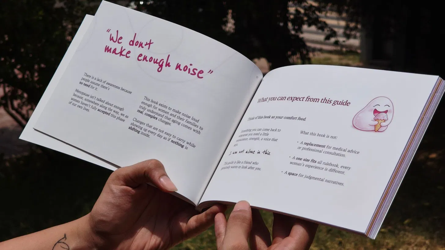
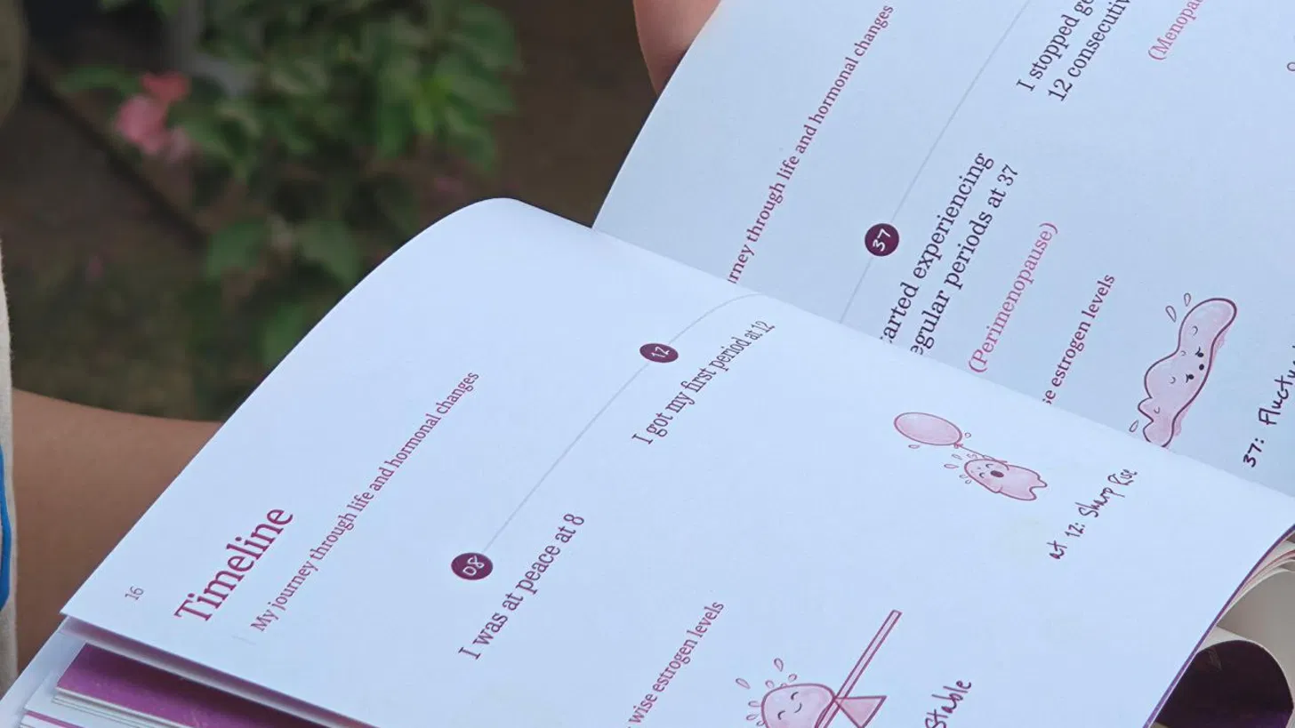
A 70-page publication researched, written, illustrated, and tested that makes perimenopause feel like something a woman can finally name, share, and navigate with support.
Primary research across a 60-woman survey, interviews with women and gynecologists, and literature review identified the root cause: not a knowledge gap, but the absence of a legitimising framework for this transition in Indian households.
A system of publication, Know and Reflect card deck, postcard kit, and badges travels from clinic to home, and from her hands to her family’s, without requiring her to explain herself first.

Context
In India, the average age of menopause is 46, five years earlier than the global average. By 2026, an estimated 401 million Indian women will be aged 45 and above. Yet over 60% go through this transition without adequate medical support, and 81% of women cannot name all its phases.
This is not a niche health concern. It is one of the most universal experiences in a woman's life and one of the least designed for.
Challenge
The easy framing is an information problem. But the research revealed something more structurally difficult: women who knew about menopause still didn't talk about it at home. Women who felt comfortable discussing it still visited doctors in secret. Husbands who were informed still dismissed symptoms with “yeh roz ka hai.” (This is a story that happens every day.)
The challenge was not building a better brochure. It was designing something that could legitimise this transition within the household, not just within the woman.
Discovery
Three data sources. One consistent pattern.
A survey of 60 women revealed that mood swings, not hot flashes, were the most commonly reported symptom at 68.3%. The most emotional dimension of this experience was the most invisible one.
Gynecologist interviews confirmed what the numbers suggested: doctors spend 10 to 15 minutes of every 30-minute private consultation on foundational education, explaining what perimenopause is, why symptoms are happening, and why treatment is even possible. That is 33 to 50% of paid clinical time lost to information that a designed object could have delivered beforehand.
Interviews with women revealed the third and most important finding: 72% felt comfortable talking about menopause. 44% of those same women never had that conversation at home. The gap was not willingness; it was the absence of an environment prepared to receive it.
The root cause: Compounded Socio-Biological Marginalisation, a self-reinforcing system in which the domestic, cultural, medical, and institutional layers of a woman's world consistently communicate that this transition does not warrant collective attention.
Insight
Four key insights shaped every design decision that followed.
The receiver gap
She is ready to speak. The room is not ready to listen. Awareness exists individually but not collectively, and the household environment directly affects the clinical severity of her symptoms.
The maintenance trap
The home leaves no room for her to be unwell. Women described continuing to cook, clean, and manage through fatigue, joint pain, and mood disruption because the domestic structure offered no sanctioned space for pause.
The knowledge void
38% of women first learned about perimenopause in their late 30s or early 40s, often while already in it. What their mothers didn't know, they passed down anyway: the framework of endurance rather than understanding.
Psychological dismissal
The most reported symptom is emotional. The least addressed is emotional. Mood changes are read as personality, not biology, making acknowledgement least likely for the women most affected.
Design decisions
Why a physical publication, not an app
Homemakers are not absent from digital; they are most active on WhatsApp, in informal peer groups. But print carries a different kind of credibility. It can wait in a gynecologist's clinic, sit on a kitchen counter, and be picked up by a husband without the woman having to orchestrate the encounter.
Why the tone is warm, not clinical
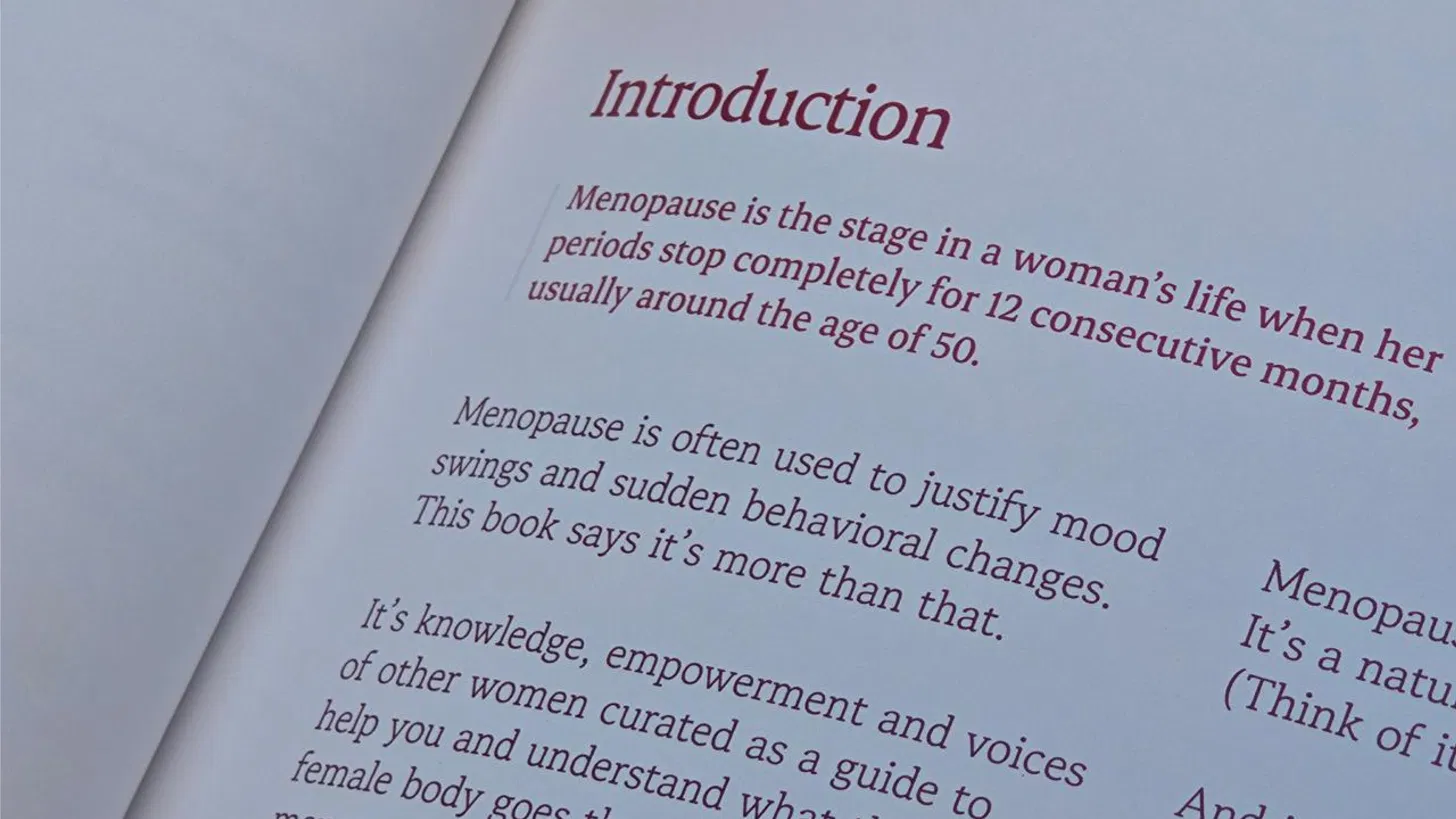
The publication was written the way a trusted friend would speak: direct, warm, occasionally funny, never pitying. The woman is not treated as a patient. She is treated as someone who deserved to know this sooner.
The content strategy
Experience → Recognition → Explanation → Reassurance → Expression.
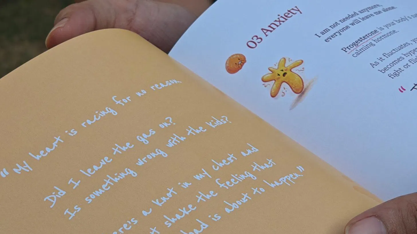
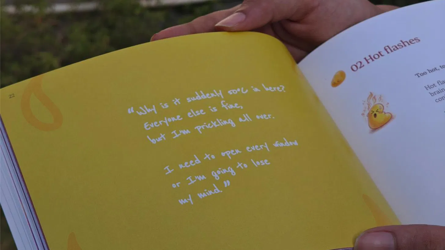
Every symptom section opens with an interior monologue, a woman's real thought, mid-experience, before she has a name for what is happening. Recognition comes before explanation; feeling seen before being informed.
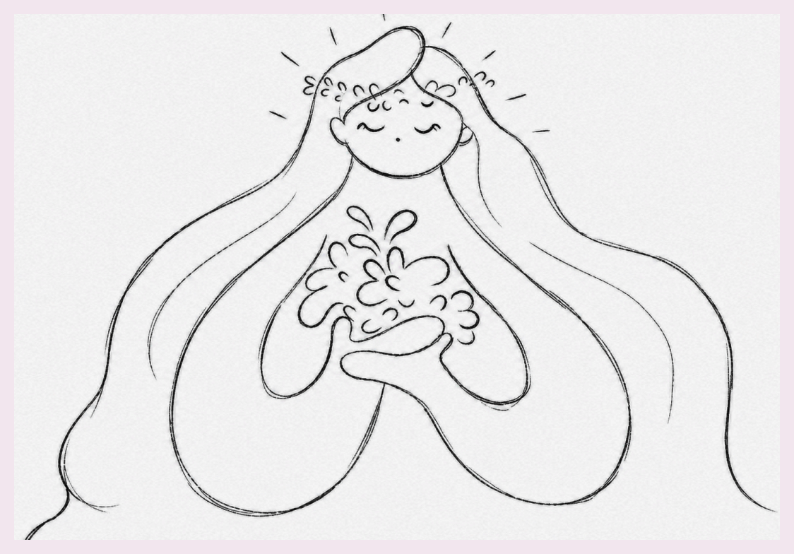


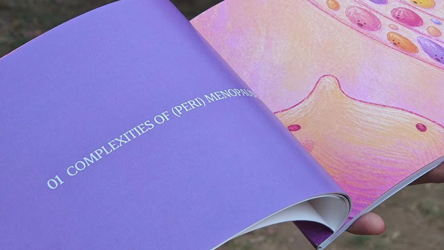
All illustrations in un.paused were first drawn by hand. AI rendering tools were subsequently used to develop colour, texture, and final finish, with all creative direction, character design, and stylistic decisions originating from hand-drawn originals.



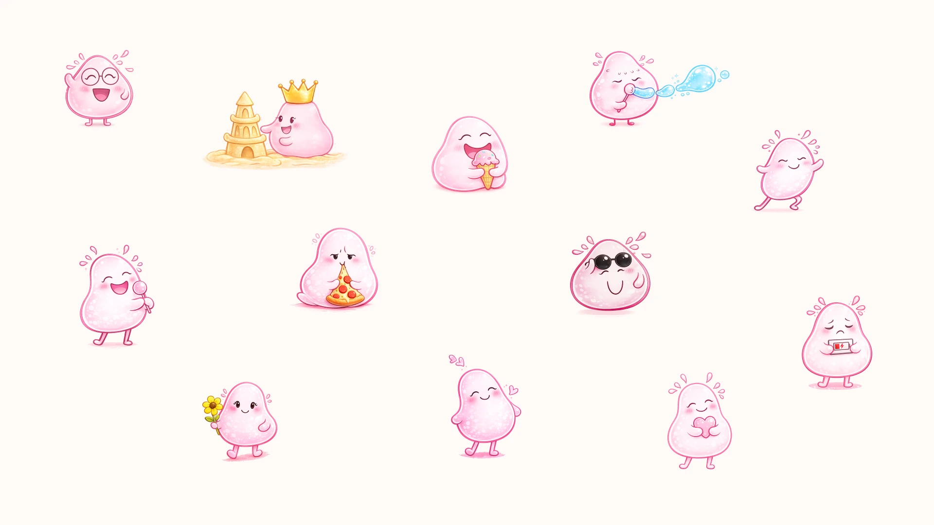
The system
The typography as emotional register
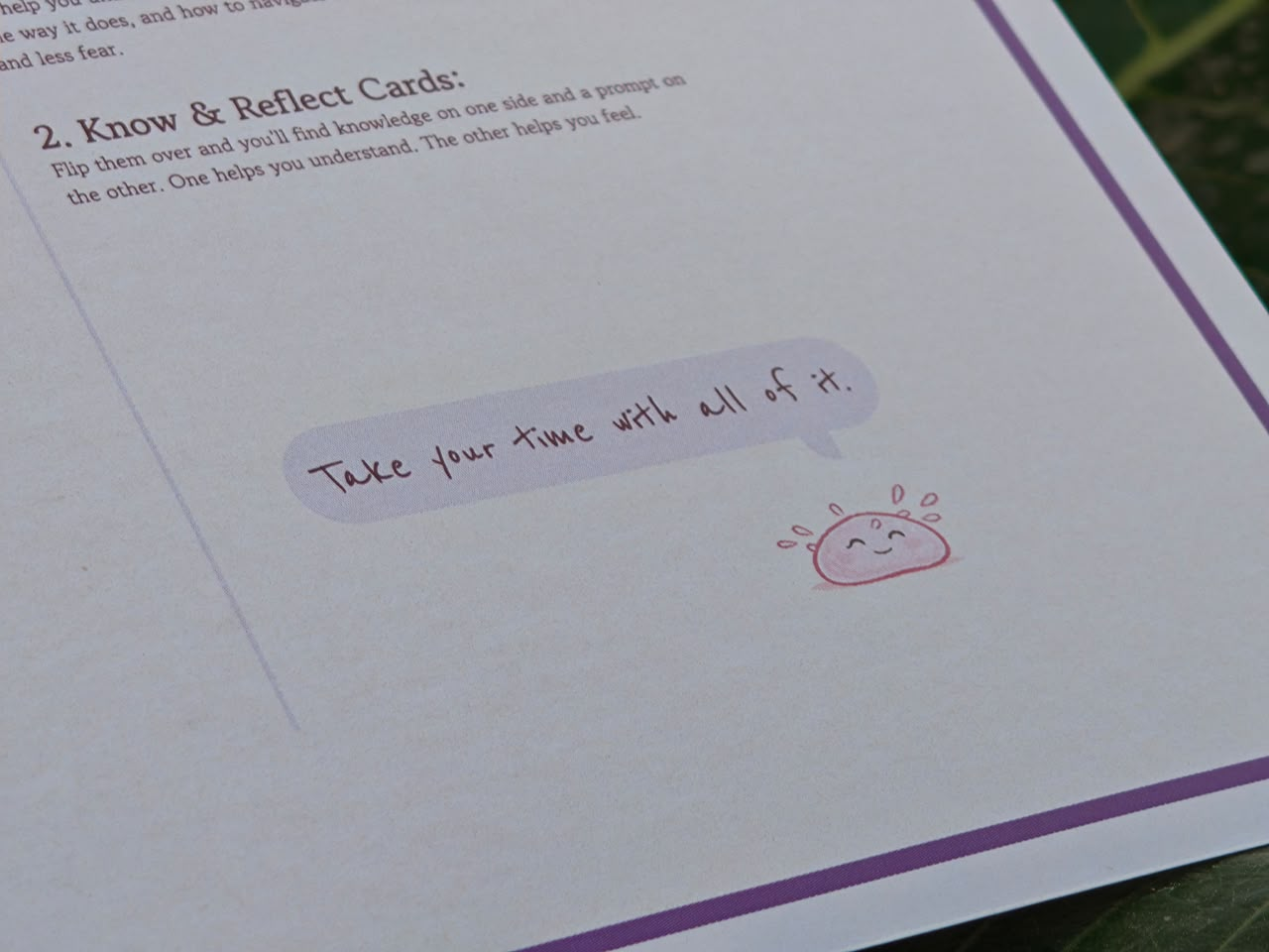
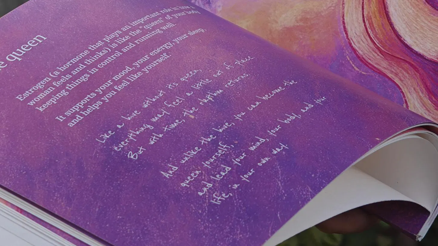
Four typefaces. Erode for structure and authority. Besley for clarity and warmth. Gowun Batang for readability across extended, emotionally dense content. And a handwritten font for moments that need to feel like a note passed directly from one person to another, the moments of permission and reassurance.
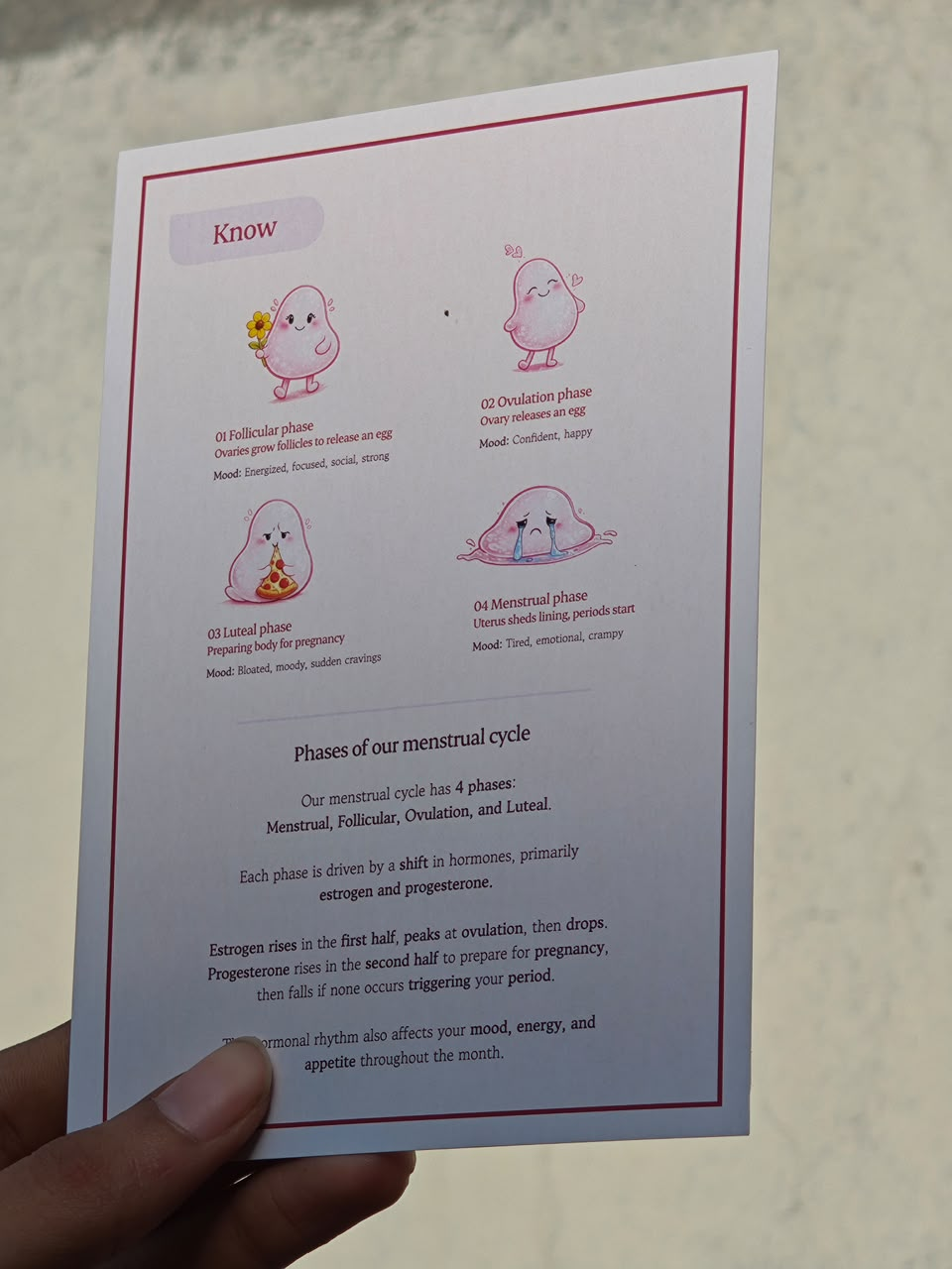
The Know and Reflect card deck
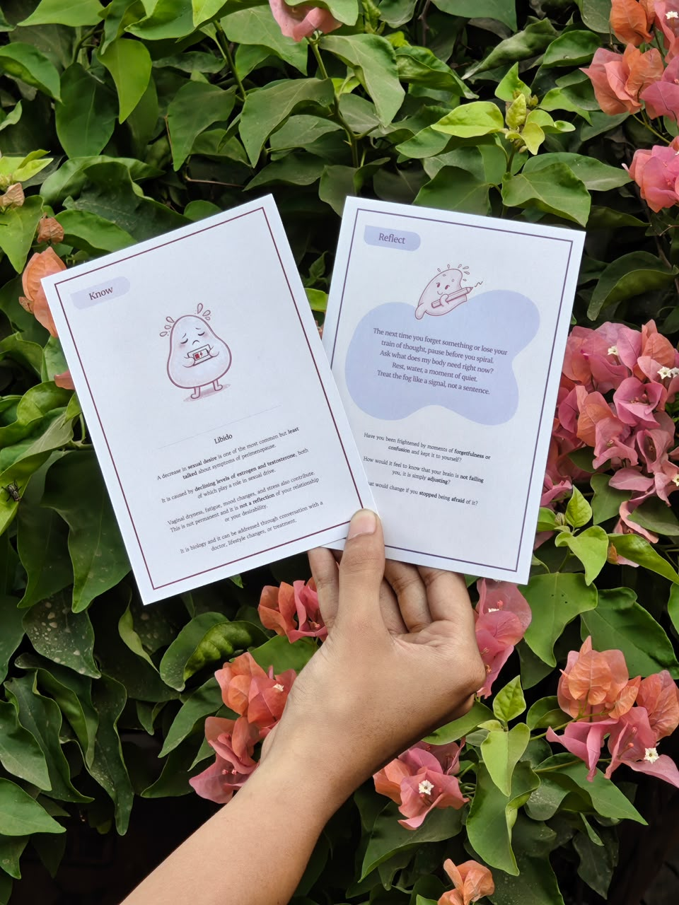
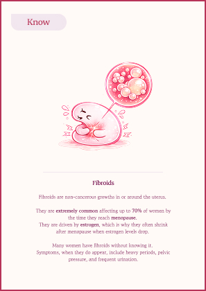
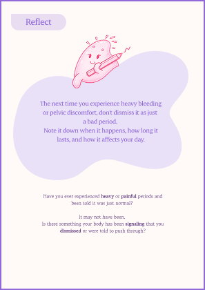
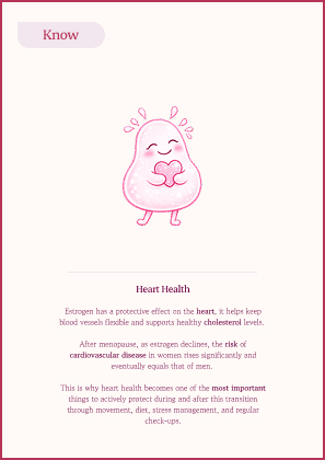
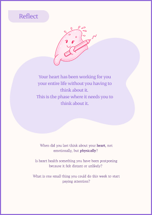
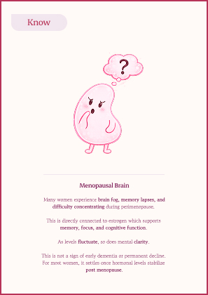
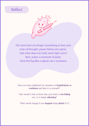
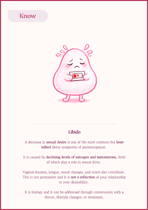
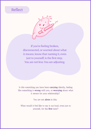
The publication gives depth. The cards give frequency. Five themes: the menstrual cycle, fibroids, heart health, the menopausal brain, and libido, were chosen because they are adjacent to menopause, deeply relevant to long-term health, and almost universally absent from informal knowledge networks. Each card carries a Know prompt on one side and a Reflect prompt on the other.
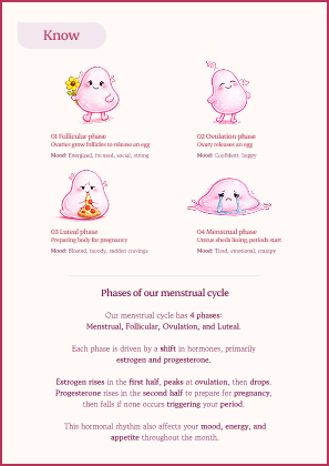
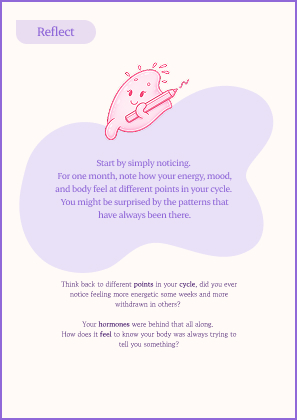
The kit as a system
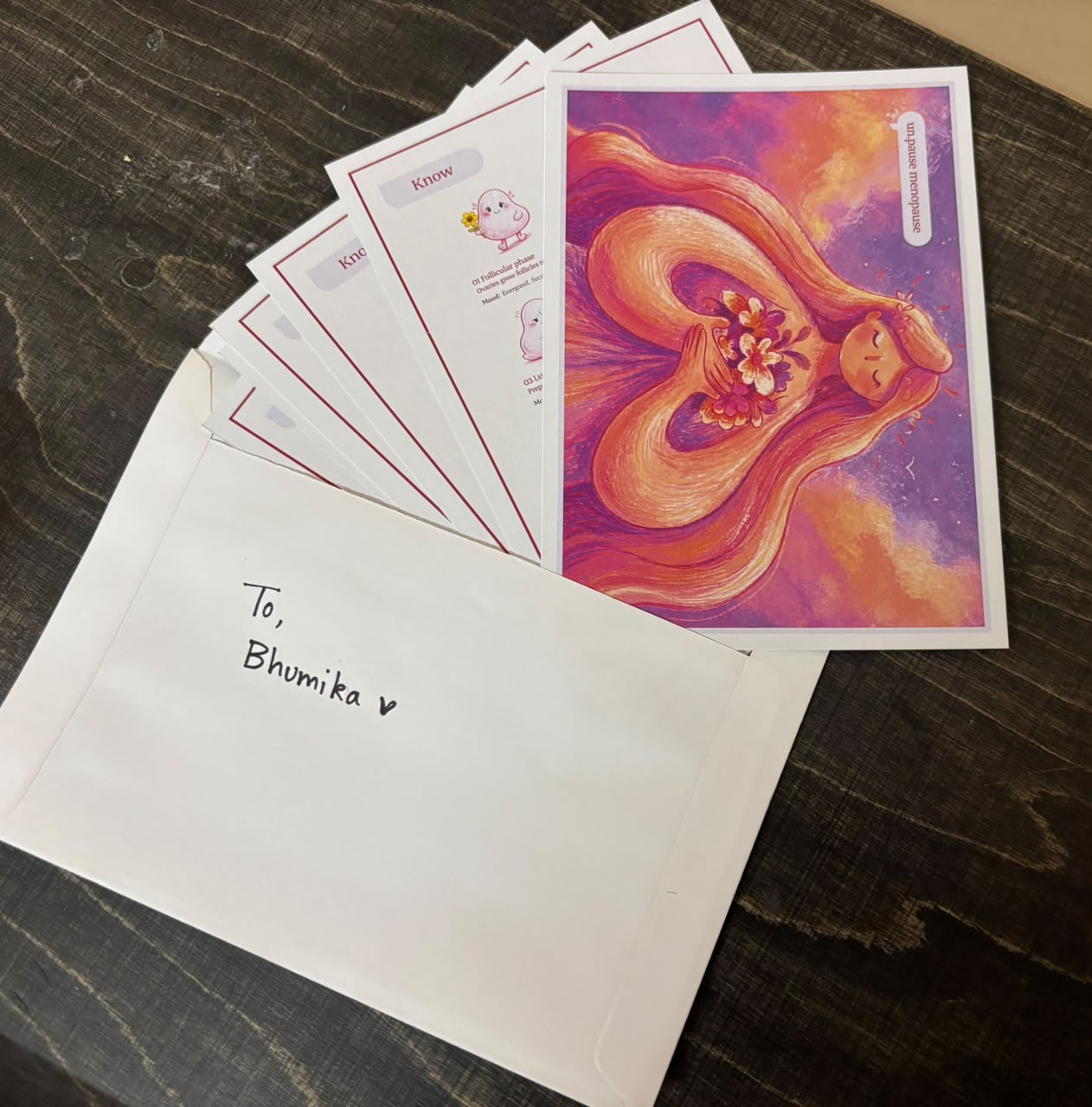
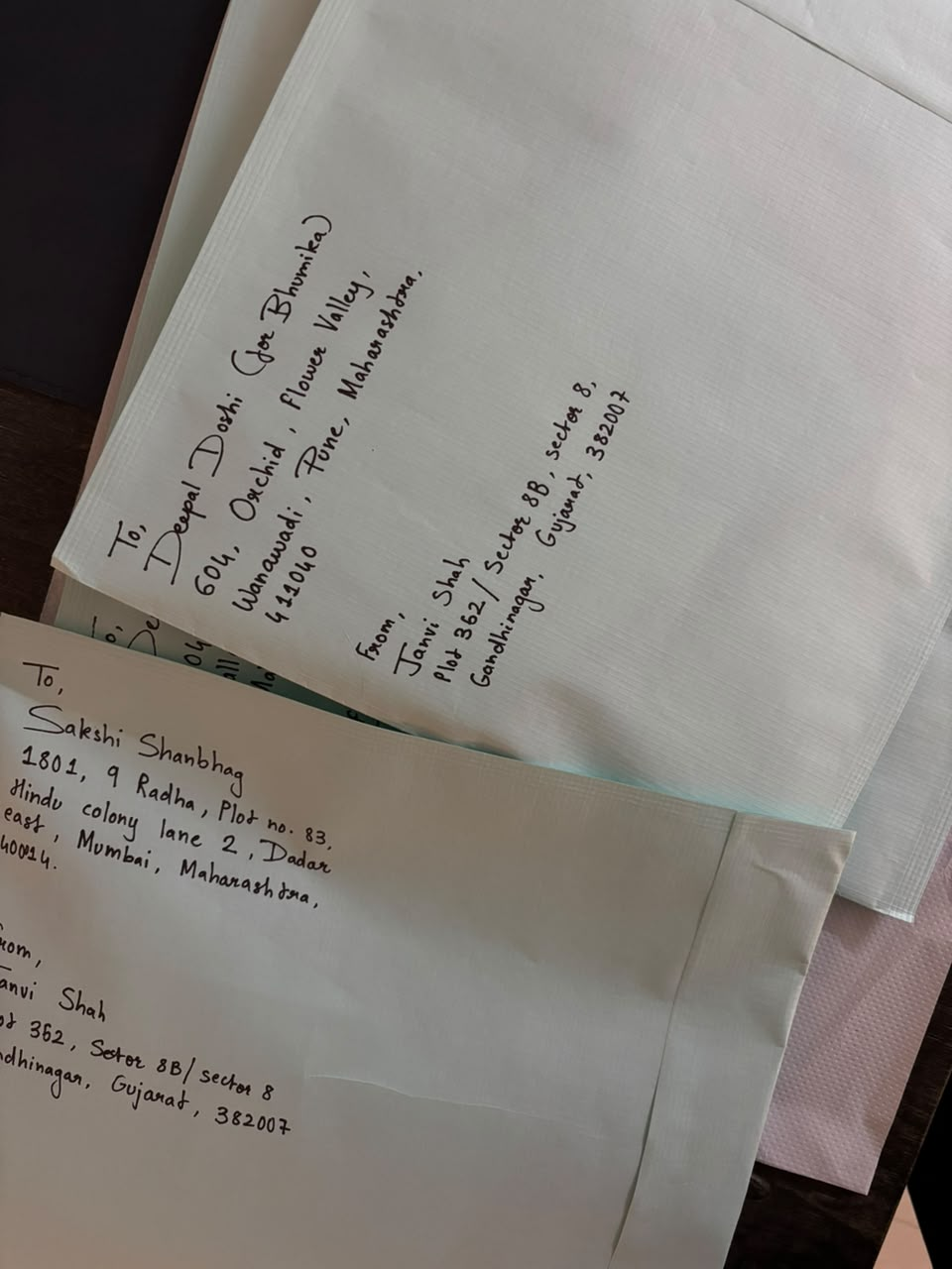
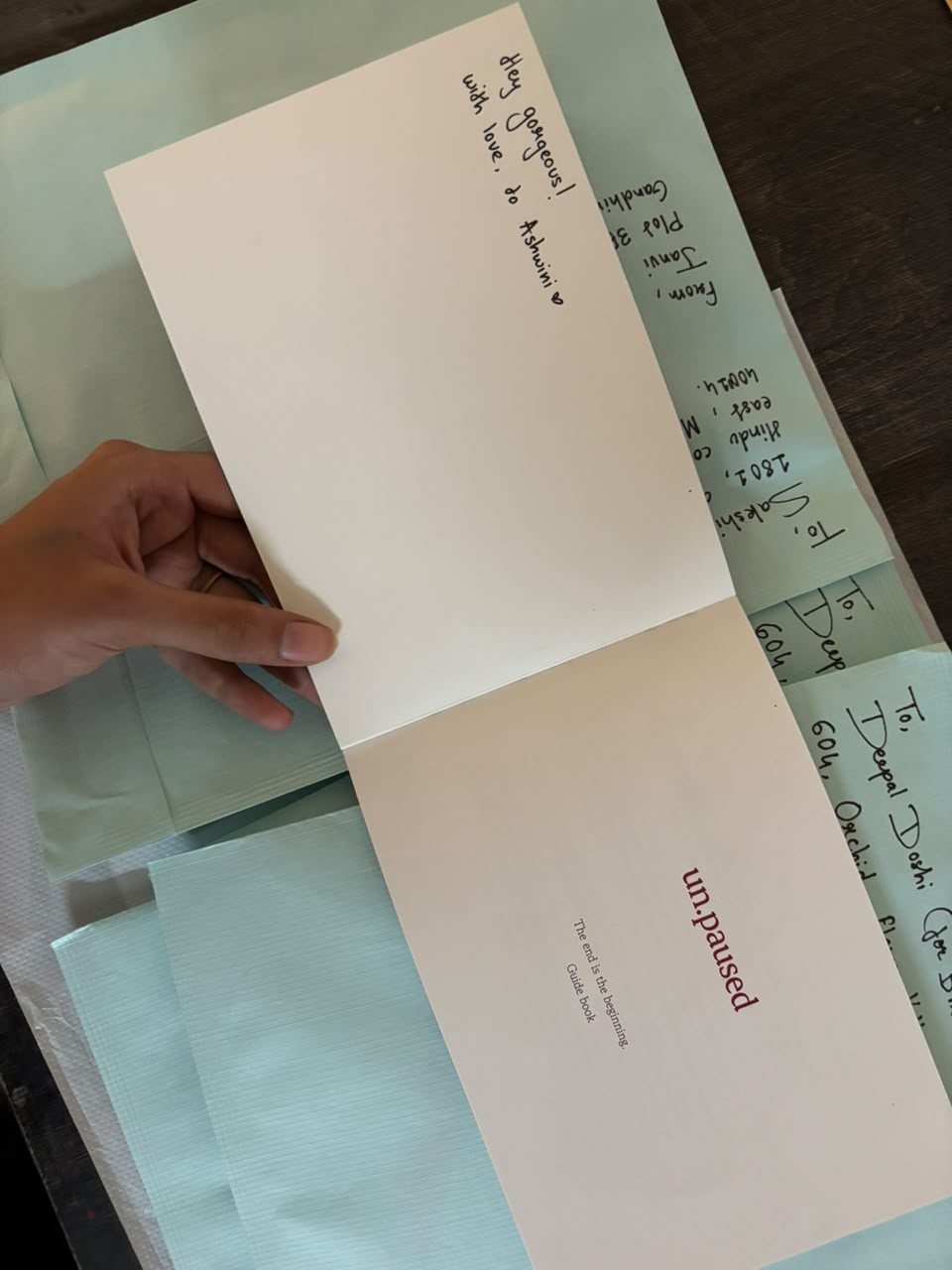
Publication, card deck, and postcards were designed to work together and independently. The postcard contextualises the kit and ensures every woman who receives it knows what she's holding and why. The system travels from clinic to home, from a woman to her family, and from one household to the next.
Read the publication
Outcome
The publication was tested with women across age groups and household contexts. Feedback confirmed that the content was landing not just as information, but as recognition. Women described feeling seen. Several described showing it to their husbands without explanation.
Gynecologist feedback confirmed the clinical utility: a patient who arrives having read this publication requires less foundational education, freeing time for actual treatment. A single gynecologist distributing the book could save an estimated 60 minutes of clinical education per day, approximately 280 hours, or nearly 12 working days, per year.
The project does not claim to have solved the problem. It claims to have made the first designed object in India that gives a woman the language to name what is happening to her, and something she can hand to the people around her without having to find the words herself.
Feedback
“The content is very good & helpful. The design, description etc. is also very nice! Good information, short & sweet, easy to understand!”
“I liked it and it is very useful.”
“I liked the way you have assimilated the facts of this stage of life of a woman. Very well written. I loved the Know and Reflect card the most.”
“Very informative.”
“The content is very good & helpful. The design, description etc. is also very nice! Good information, short & sweet, easy to understand!”
“I liked it and it is very useful.”
“I liked the way you have assimilated the facts of this stage of life of a woman. Very well written. I loved the Know and Reflect card the most.”
“Very informative.”
Reflection
This project started as a brief about perimenopause awareness. It became something more difficult and more important than that.
The hardest design problem was not visual. It was the gap between information and permission, the fact that a woman can know everything about perimenopause and still not feel allowed to act on that knowledge in her own home. It is not enough to communicate clearly. The object itself has to be something she feels comfortable placing in the shared space of her life.
Designing for a sensitive topic taught me that empathy without specificity is just sentiment. Every decision, the tone, sequencing, illustration style, and typeface at the bottom of a page, had to be grounded in what real women said in interviews, not in what felt intuitively warm. The research was not background. It was the brief.
I also learned that the most important audience is often the one you don't design for first. The husbands, daughters, and children who pick up a book left on a coffee table are the people who change the household environment. If I began again, I would design for them earlier and more deliberately.
What I carry forward is a way of working: research first, always; test with the people who will push back, not just those who will be kind; and never mistake a warm response for a validated design. The women who said this was helpful were telling me something true. The mentors who said it was 30% of what it should be were also telling me something true. Both can be right at the same time.
un.paused is not finished. It is, as its name suggests, just unpaused.
Image highlights and behind the scenes